

Picture this: You’re comfortably lounging on your couch, smartphone in hand, searching for the perfect pair of shoes. You click on a promising website, but suddenly the text is microscopic, buttons are impossible to tap, and you have to constantly zoom and scroll sideways. Frustrated, you leave immediately. We’ve been there too, and let us tell you – this is exactly what responsive design aims to prevent.
What is Responsive Web Design?
Remember the days when websites were built exclusively for desktop screens? Well, those days are long gone. Responsive web design is like having a website that’s a shape-shifter – it automatically adjusts its layout and content to look and work great on any device, whether it’s a smartphone, tablet, laptop, or desktop computer.
We recently worked with a client who was losing mobile customers due to a rigid, desktop-only design. After implementing responsive design, their mobile conversion rate jumped by 150%. That’s the power of adaptation in action.
Why is Responsive Design Important in 2025?
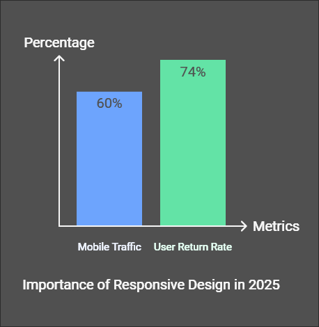
Let us paint you a picture with some compelling statistics:
- 60% of all internet traffic now comes from mobile devices
- 74% of users are more likely to return to mobile-friendly websites
- Google predominantly uses mobile-first indexing for ranking websites
The Mobile-First Revolution
You might be wondering, “Why all this fuss about mobile?” Here’s the thing: we’re living in an era where people are more likely to first encounter your website on a 6-inch screen than a 27-inch monitor. According to recent studies by ManyPixels, mobile devices have become the primary means of accessing the internet for most users.
How Does Responsive Design Work?
Think of responsive design as a liquid that takes the shape of its container. It uses three main ingredients:
- Fluid Grids: Instead of fixed-width layouts, elements use relative units like percentages
- Flexible Images: Images that scale within their containing elements
- Media Queries: CSS rules that apply different styles based on device characteristics
Understanding Breakpoints in Responsive Design
Breakpoints are like the traffic signals of responsive design – they determine when your layout should change to provide the optimal viewing experience. Here’s a simple breakdown:
| Device Type | Typical Breakpoint | Common Use Cases |
| Smartphones | 320px – 480px | Single column layouts |
| Tablets | 481px – 768px | Two column layouts |
| Laptops | 769px – 1024px | Multi-column layouts |
| Desktops | 1025px+ | Full website experience |
Best Practices for Responsive Design
Drawing from my experience and industry standards, here are some crucial practices to follow:
1. Start with Mobile Design First
Remember when we mentioned that client earlier? Their success came from redesigning with a mobile-first approach. Start with the smallest screen and work your way up – it’s easier to add complexity than to remove it.
2. Optimize Images
Nobody likes waiting for images to load, especially on mobile data. Use:
- Responsive images with srcset
- Proper image compression
- Lazy loading for better performance
3. Touch-Friendly Navigation
Ever tried clicking a tiny link on your phone? Frustrating, right? Make sure all interactive elements are at least 44×44 pixels for comfortable tapping.
The Business Impact of Responsive Design
Let us share a real-world example: A small e-commerce store we consulted for saw their mobile abandonment rate drop by 35% after implementing responsive design. According to a research, businesses with responsive websites experience:
- Higher conversion rates
- Improved user engagement
- Better SEO rankings
- Reduced maintenance costs
Common Challenges and Solutions
Even the best designers face challenges with responsive design. Here are some common ones I’ve encountered and their solutions:
Navigation Menus
Challenge: Complex navigation menus don’t translate well to mobile screens Solution: Implement hamburger menus or priority+ navigation patterns
Performance
Challenge: Slow loading times on mobile devices Solution: Implement progressive enhancement and lazy loading
The Future of Responsive Design
As we look ahead, responsive design is evolving beyond just screen sizes. Recent research suggests we’re moving toward:
- AI-driven responsive layouts
- Context-aware design
- Progressive Web Apps (PWAs)
Conclusion
In today’s mobile-first world, responsive design isn’t just a nice-to-have – it’s essential for survival in the digital landscape. Whether you’re a business owner, developer, or designer, embracing responsive design principles will put you ahead of the curve.
Ready to Make Your Website Responsive?
Start by testing your current website on different devices. Use tools like BrowserStack to see how your site performs across various screen sizes. Remember, every journey toward better user experience starts with a single step.


What do you think?
It’s a modern look and suits up-and-coming brands that offer a unique product or service.